Documentation/4.6/Developers/Style Guide/UI
|
For the latest Slicer documentation, visit the read-the-docs. |
General guidelines
- As a general rule, follow those following guidelines:
Panels
Section
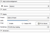
A section is used in a panel to categorize parameters by visually grouping them. In the Volume Rendering module, there are 3 sections: 'Inputs', 'Display', and 'Advanced...'. By default, the 'Inputs' and 'Advanced...' sections are collapsed. This reduces visual cluttering by hiding advanced and rarely used parameters. Sections should be organized in such a way that the workflow takes the user from top to bottom:
- The 'Inputs' section is first as it controls the inputs of the volume rendering.
- then the 'Display' section controls important display properties
- finally, if the previous parameters are not enough to obtain the desired result, the Advanced.. section offers fine tuning of the volume rendering.
Please note that the Advanced-ness of a section doesn't necessarily impacts its position in the section ordering. To create a section you must use a ctkCollapsibleButton [1] with no panel frame. Typically, the main node selector (Volume: in Volume Rendering) is the first GUI element and is outside any section.
Parameters
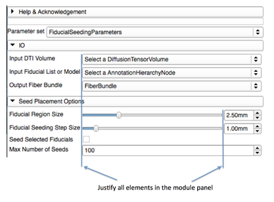
Elements in panels should be justified (use of a QFormLayout can simplify the task)
Text
- Capitalize the first letter in any text specified for a label or button:
- "Load volumes" instead of "Load Volumes"
- More capitalization rules
- Try to use brief phrases when specifying text for a label or button rather than using sentences or sentence fragments ( use "Load volumes" instead of "Choose a volume to load")
- Provide fully descriptive tool tips with each widget defined
- Don't use colon after each parameter labels:
- "Load volumes" instead of "Load volumes:"
Layouts
- Use the default values for the margins or 0. Default margins are automatically controlled by the Slicer custom style (see QStyle::PM_LayoutLeftMargin)
- The minimum size hint of the top level module widget is used to determine the minimum width of the module. The minimum width of a module must not be larger than 500px (subject to change). This is enforced by the automatic test qSlicerMY_MODULE_NAMEModuleGenericTest. If the width is too large, you have multiple ways of narrowing the module panel:
- In Qt Designer, you can ensure the sizing is correct by changing the QLayout::SizeConstraint to
QLayout::SetMinimumSize. When you preview the module (Ctrl-R), it appears with the same size as it would in Slicer. - Ideally the minimum size hint of each wide GUI element should be fixed, it is unlikely that a large size hint is "ideal".
- Alternatively, you might want to investigate the following:
- Consider setting the horizontal size policy of such element to QSizePolicy::Ignored
- If the element is in a form layout, QFormLayout::layoutFieldGrowthPolicy might need to be set to
AllNonFixedFieldsGrow. - All those changes can be set from Qt Designer.
- In Qt Designer, you can ensure the sizing is correct by changing the QLayout::SizeConstraint to

