Slicer3:UIDesign:WorkingProblems:RadioCheckButtons
Back to Slicer3 UI Design
Back to Radio and Check Button Design
Various experiments below for quickly readable icon state: either "selected" "deselected" or "disabled". Varying color, contrast, texture, etc. to find a design solution that reads out state quickly, at a glance. Drop shadow makes icons pop, but requires more pixels in each icon and we might have to re-do all existing icons to ensure good packing behavior. Also, we might get tired of this effect. Contrast differences add more visual "pop" than color differences. The greyed out dotted lines provide a good solution for "deselected" state, with good visual contrast to the black outlined "selected" state. Both are clearly distinguished from the "disabled" state. Options P&Q are preferred below.
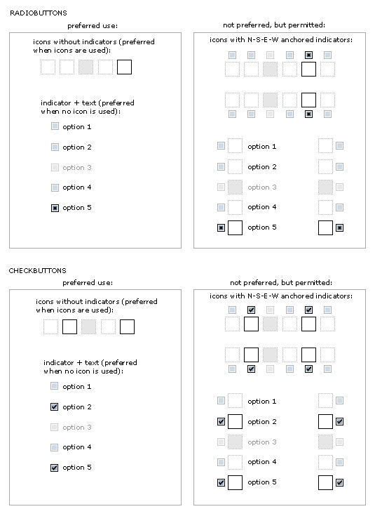
How do various icon configurations appear with and without icons, text, and indicators? The preferred convention would be to use either indicators + text or icons alone -- rather than indicators + icons together, or indicators, icons + text together. Sometimes this extra information may be necessary, so the last two embodiments are not ruled out.
Best without indicator, but ok with too.
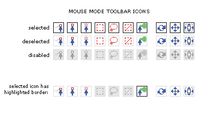
Applying new design to Mouse Mode Toolbar
Easier to comprehend at a glance, and no ambiguity between "disabled" and "deselected"

