Difference between revisions of "Documentation/4.1/Developers/Style Guide/UI"
From Slicer Wiki
m (→Panels) |
|||
| Line 8: | Line 8: | ||
|- align="left" | |- align="left" | ||
| | | | ||
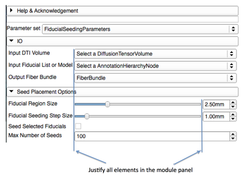
| − | *Elements in panels should be justified (use of a [http://doc.qt.nokia.com/4.7-snapshot/qformlayout.html QFormLayout] can simplify | + | *Elements in panels should be justified (use of a [http://doc.qt.nokia.com/4.7-snapshot/qformlayout.html QFormLayout] can simplify the task) |
| − | |||
*Capitalize the first letter in any text specified for a label or button | *Capitalize the first letter in any text specified for a label or button | ||
** "Load volumes" instead of "Load Volumes" | ** "Load volumes" instead of "Load Volumes" | ||
| Line 17: | Line 16: | ||
===Section=== | ===Section=== | ||
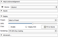
[[Image:QSlicerVolumeRendering-default.png|thumb|right|200px|Volume Rendering sections]] | [[Image:QSlicerVolumeRendering-default.png|thumb|right|200px|Volume Rendering sections]] | ||
| − | A section is used in a panel to categorize parameters by visually grouping them. In the [[Documentation/{{documentation/version}}/Modules/VolumeRendering|Volume Rendering module]], there are 3 sections: 'Inputs', 'Display', and 'Advanced...'. By default, the 'Inputs' and 'Advanced...' sections are collapsed. It reduce visual cluttering by hiding advanced and rarely used parameters. Sections | + | A section is used in a panel to categorize parameters by visually grouping them. In the [[Documentation/{{documentation/version}}/Modules/VolumeRendering|Volume Rendering module]], there are 3 sections: 'Inputs', 'Display', and 'Advanced...'. By default, the 'Inputs' and 'Advanced...' sections are collapsed. It reduce visual cluttering by hiding advanced and rarely used parameters. Sections should be organized in such a way that the workflow takes the user from top to bottom: |
# The 'Inputs' section is first as it controls the inputs of the volume rendering. | # The 'Inputs' section is first as it controls the inputs of the volume rendering. | ||
# then the 'Display' section controls important display properties | # then the 'Display' section controls important display properties | ||
Revision as of 21:33, 16 April 2012
Home < Documentation < 4.1 < Developers < Style Guide < UIContents
General guidelines
- As a general rule, follow those following guidelines:
Panels
SectionA section is used in a panel to categorize parameters by visually grouping them. In the Volume Rendering module, there are 3 sections: 'Inputs', 'Display', and 'Advanced...'. By default, the 'Inputs' and 'Advanced...' sections are collapsed. It reduce visual cluttering by hiding advanced and rarely used parameters. Sections should be organized in such a way that the workflow takes the user from top to bottom:
Please note that the Advanced-ness of a section doesn't necessarily impacts its position in the section ordering. To create a section you must use a ctkCollapsibleButton [1] with no panel frame. Typically, the main node selector (Volume: in Volume Rendering) is the first GUI element and is outside any section. |

|
Layouts
- Use the default values for the margins or 0. Default margins are automatically controlled by the Slicer custom style (see QStyle::PM_LayoutLeftMargin)
- The minimum size hint of the top level module widget is used to determine the minimum width of the module. In Qt Designer, you can ensure it's sizing is correct by changing the QLayout::SizeConstraint to QLayout::SetMinimumSize.
