Slicer3:UIDesign
Return to Slicer3 Interface Design and Usability
Contents
- 1 Embodiment
- 2 Slicer users
- 3 Working problem: spot GUI fixing
- 4 Working problem: Application-wide support for ROI definition
- 5 Working problem: Consistent checkbuttons and radiobuttons across platforms (Issue Resolved)
- 6 Working problem: Navigating with fiducials (Issue resolved: implemented in Editor module and Edit Box)
- 7 Working problem: Different "Picking" Mouse Modes in Slicer3
- 8 Working problem: Cine display for viewing and analyzing multi-volume data in Slicer3
- 9 Working problem: Mouse Modes in Slicer3
Embodiment
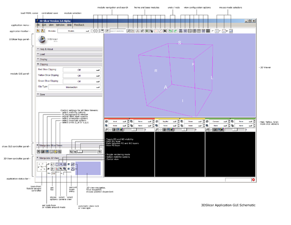
- Current schematic of the main application GUI: ( higher resolution image: Media:GUIMap.png )
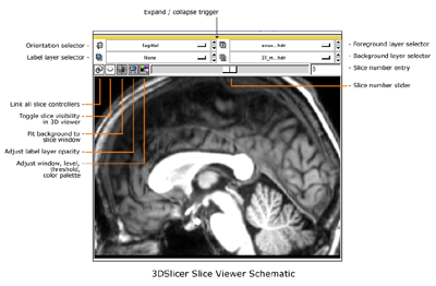
- Current schematic of a Slice Viewer and Controller: (higher resolution image: Media:SliceGUI.png )
- Design sketch for the 3D navigation & Slice magnifier widget
- Early look and feel draft
- First sketch of the GUI layout design
- Link to a running visual blog highlighting progress in the Slicer3 embodiment.
Slicer users
Core user communities:
- (NAC) Longitudinal and multi-channel dataset analysis
- (BIRN/NA-MIC) Individual and group analysis
- (IGT/AMIGO) Real-time control and tracking in the operating theater
- (IGT) Neurosurgical planning and guidance
Types of users:
- Algorithm researchers (who work within 3DSlicer's development environment and with associated toolkits)
- Biomedical engineers (who rely on 3DSlicer's interactive enironment and scripting capabilities)
- Application scientists (who use 3DSlicer as a desktop application and turnkey system)
Current status and TO-DO
The existing base classes form a basic framework for the UI. For the Alpha/Beta releases, we provided a main application window with the general layout described in our current design. For the Release deadline, we plan to complete the overall application GUI. Things we are focusing on:
- choose radiobutton/checkbutton with/without icon convention
- finish content for slicer human interface and style guidelines
- theme font, match to screen resolution, set in application settings
- finish slicer mouse modes
- think through color palette to support semantic applications
- update module GUI how-to
- refine ROI toolbox design, work with developer to implement
- refine lightbox viewer
- implement mechanism to specify oblique view
- build classes for pop-up information (help and context info)
- copyrights
Working problem: spot GUI fixing
Scene snapshot panel
This GUI panel allows the scene to be recorded at any point and restored later; it's particularly useful for sharing relevant views of a scene with collaborators or for instruction. The layout can be made more compact and improved in general. Also, colors on the 'restore' button are overly bold, and the red/green imply more than they intend.
Current layout:
New design:
The restore button needs to convey three states:
- no scene snapshots exist to restore
- a scene snapshot is selected to be restored, but is not yet visible.
- a selected scene snapshot has been restored, and is displayed.
Working problem: Application-wide support for ROI definition
GOALS:
- determine relationships between label maps, implicit regions (spheres, circles, ellipses), and vector-format region definitions.
- determine what kinds of ROIs we will allow users to create/edit at application level
- determine how to expose ROI functionality application-wide (without "wormholing" to an ROI module)
- provide tools for defining, editing ROIs
- provide tools for converting ROIs into label maps (?)
- provide good mouse+hotkey design
- generalize implementation to eventually accommodate DICOM-format ROIs
- determine relationship between fiducial lists and ROIs (from implementation pov).
Draft design:
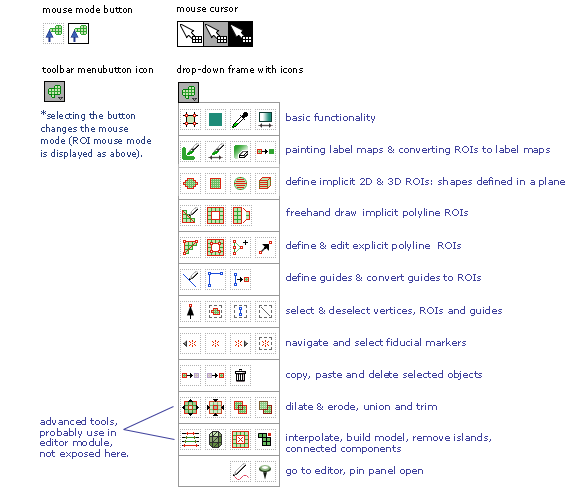
Sketch of the draft interface for the "ROI toolbox" is below:
Collecting feedback on the complete Interface & interaction design drafted at June NA-MIC Project Week meeting / MIT:
Working problem: Consistent checkbuttons and radiobuttons across platforms (Issue Resolved)
GOALS
Currently, radiobutton and checkbutton indicators display their state differently on different platforms Slicer supports. For instance, visually similar indicators on linux and windows actually represent different states. This can be confusing for people who work on both platforms. So instead of using the default Tk bitmaps for the indicators, we are proposing to use our own image data which will display the same on all platforms.
- develop a custom slicer widget as an extension of vtkKWCheckButton
- disambiguate current "deslected" radiobutton icon state -- it can be read as "disabled"
- override method for turning the old indicator visible/invisible (always keep it off)
- develop visually parseable convention for icons to represent:
- selected
- deselected
- disabled
- use methods SetImageToIcon and SetSelectImageToIcon to display selected/deselected icons, selected/deselected icons+indicators
- provide blank icons with and without indicators for people to download.
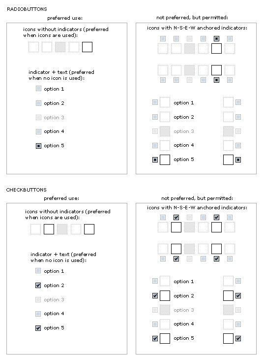
Various experiments below for quickly readable icon state: either "selected" "deselected" or "disabled". Varying color, contrast, texture, etc. to find a design solution that reads out state quickly, at a glance. Drop shadow makes icons pop, but requires more pixels in each icon and we might have to re-do all existing icons to ensure good packing behavior. Also, we might get tired of this effect. Contrast differences add more visual "pop" than color differences. The greyed out dotted lines provide a good solution for "deselected" state, with good visual contrast to the black outlined "selected" state. Both are clearly distinguished from the "disabled" state. Options P&Q are preferred below.
How do various icon configurations appear with and without icons, text, and indicators? The preferred convention would be to use either indicators + text or icons alone -- rather than indicators + icons together, or indicators, icons + text together. Sometimes this extra information may be necessary, so the last two embodiments are not ruled out.
Best without indicator, but ok with too.
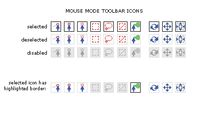
Applying new design to Mouse Mode Toolbar
Easier to comprehend at a glance, and no ambiguity between "disabled" and "deselected"
GOALS:
- use fiducials as markers for features of interest
- allow navigation to fiducial points within a slice window and
- allow navigation to same fiducial point in all slice windows (a feature we're calling 'jumpslice').
- want to read-out which fiducial is currently being viewed while navigating
- want to expose these features in top level in each slice controller widget
- want also to keep the slice scrollbar from getting too small to use.
- want to indicate which slice scrollbar direction is R,L, S,I, A,P, depending on orientation
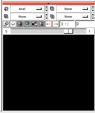
Proposed modification of vtkSliceControllerWidget:
The widget below shows a read-out/entry for current fiducial; buttons for navigate-to-next-fiducial and navigate-to-previous-fiducial. Slice scrollbar is longer, and contains labels at each endpoint.
- user can navigate forward, backward using fiducial jump buttons
- user can enter an ordinal number (or name?) to jump to a fiducial (above, third fiducial of 12 total in the list)
- if viewers are unlinked, only the active slice viewer is updated
- if viewers are linked, all viewers are updated to show the slice containing the same fiducial.
- if a viewer's slice scrollbar is adjusted, its fiducial read-out is reset to ""
- any time a new fiducial is placed in a viewer, the fiducial read-out is updated to that (current) fiducial.
Questions about placing and moving new fiducials:
- should placing a new fiducial in the viewer cause a jumpslice event if all viewers are linked?
Seems we may not always want to trigger this by default. A reasonable solution for this is to unlink viewers when placing fiducials if you don't want the jumpslice behavior...
- should moving a newly placed fiducial in the viewer cause a jumpslice event if all viewers are linked? Again, seems we may not want this default behavior. And again, it seems easy enough to unlink viewers if you don't want the jumpslice behavior.
- can we undo the creation and placement of a fiducal easily, so that while exploring the data, user can click, look, delete, and click again -- as an alternative to grabbing and moving an existing fiducial?
- first time navigating, we start on fiducial#1. maybe we go forward to
fiducial 10 of 20. Next time navigating, do we continue on to 11, or restart at 1?
- Will there ever be too many fiducials to navigate?
- should the fiducial navigation entry (read-out) also take a fiducial NAME instead of number?
- Do we want to include other navigation options?
- With numerous fiducials, it may be hard to tell which fiducial is the corresponding one, when navigating them. Can we color the jump-fiducial temporarily to help integrate all displays?
Working problem: Different "Picking" Mouse Modes in Slicer3
At the June 2007 project week at MIT, we determined that we'll need to be able to pick several distinct things in Slicer, and the single "pick" mouse mode currently available was not going to provide the unambiguous picking functionality we need. To address this problem, we'll probably need to design a set of "pick" mouse modes. Please add your picking needs to the list developing below. Thanks!
What do we need to pick?
- single/multiple vertices on models (for plotting, we need to be able to get the closest vertex ID)
- single/multiple cells on models ( need to calcuate the vertex usually)
- single/multiple points on surfaces (for placing fiducials, get RAS)
- single/multiple models
- model groups
- single/multiple "nodes" in general
- "node" groups
- single/multiple volumes
- single/multiple fiducials
- single/multiple ROIs
- tensors
- voxels in volumes
- slices in volumes
- subvolumes
- general polygons?
- annotations?
- two points to make a line?
- for tractography, we need to pick:
- cell in a model (to get one fiber trajectory)
- entire models (to pick a bundle)
- ideally, a model group (to pick an entire structure like the corpus callosum that includes several bundles)
- It would also be very cool to have a plane widget for 3D intersection tract selection.
- for tractography and other things with an intermediate processing step before visualization (generation of glyphs or whatever)
- it may be useful for picking to indicate what was picked, if several models are displayed per node
- like: model #2 was picked, then my code can know that is a glyph model, rather than a line model, if that is ever needed.
- this depends on the final implementation of Alex's new cool display API, whether there is ever >1 model allowed
General selection pattern
- various lassos would be nice to select multiple of the thing current mode indicates
- single click to select one of the thing the current mode indicates
- control-click to select multiple of the thing the current mode indicates
- a shift-click to select ALL of the thing the current mode indicates
Working problem: Cine display for viewing and analyzing multi-volume data in Slicer3
Design for a basic cine controller:
Design studies for a cine display that allows viewing either corresponding slices in multiple volumes over time, or consecutive slices in a single volume over time. Version 4 is the most recent iteration, containing elements for specifiying the following animation parameters:
- volumes (select a volume collection to animate)
- volume (select a single volume to animate)
- display (select Green, Yellow or Red slice viewer)
- step (set slice increment within a volume, or volume increment within a collection)
- speed (set animation speed from slow to fast)
- range ( choose range of slices within a volume, or range of volumes within a group. In the former case, we assume the animation displays consecutive slices in the specified range, incrementing according to the step size. In this latter case, we assume you select the slice of interest via the usual slice viewer gui, and animation displays the corresponding slice in each volume within the collection, incrementing according to the step size. )
- current ( show or choose current slice or current volume ).
And controller icons:
- go to first frame
- play in reverse
- pause
- stop
- record a movie
- play forward
- go to last frame
- loop
- ping-pong
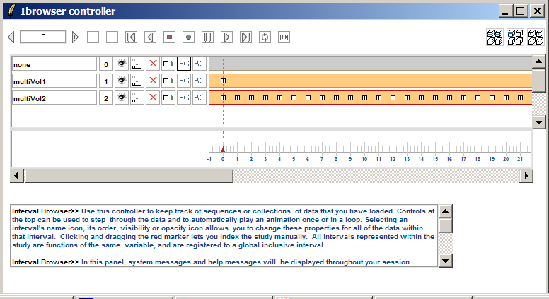
Slicer 2.6's Interval Browser controller for viewing and organizing timeseries data:
Working problem: Mouse Modes in Slicer3
Currently, a left-mouse-button click in Slicer's 3D or Slice Viewers can mean different things at different times; this can be confusing to users, and can lead to mistakes. We are currently deciding a good paradigm for defining and controlling mouse modes in Slicer's 3D viewer and 2D slice windows. We rely on mouse interaction to transform the view, and to perform explicit actions like placing a fiducial, selecting and moving a fiducial, collecting voxel-value samples, and so on. The challenge is to make all actions possible with just the left mouse button (some mice have only one button), and to disambiguate what a left-mouse-button click in the 3D and Slice viewers means.
Goals: We'd like the interaction paradigm to have the following features:
- Consistent in all slice windows and 3D viewer
- Intuitive and easy for beginners
- Fast for intermediate and expert users
- Rely on only one mouse button (but accommodate multiple mouse buttons)
- Support direct manipulation as much as possible
- Provide clear visual feedback about current mouse mode
- Support both view transformation (rotate, pan, zoom) and mouse actions (pick, manipulate, place, etc...).
---
Current problems we want to address in existing Slicer3 implementation:
- Mouse motion always in "view transform" mode
- Relies on three mouse buttons (for rotate, pan, zoom, slice scroll) which aren't always present on all computers
- Relies on hot-keys for non-transform mouse actions, which vary from module to module (tough for novice users, or forgetful intermediate users)
- 3D viewer mouse event bindings and Slice viewer mouse event bindings not entirely consistent
- Would like to free up right mouse button to invoke the display of a 'context menu'.
- Would like BOTH intuitive one-handed mouse-only interaction to be possible AND hot-key assisted shortcuts to be available.
Current bindings (not entirely consistent across 3D Viewer and Slice Viewers):
- 3D viewer: left mouse button >> rotate
- 3D viewer: middle mouse button >> pan
- 3D viewer: mouse wheel button >> zoom in/out
- 3D viewer: right mouse button, pull drag >> zoom in
- 3D viewer: right mouse button, push drag >> zoom out
- Slice viewer: left mouse button >> select/move a fiducial point
- Slice viewer: middle mouse button >> pan
- Slice viewer: mouse wheel button >> scroll slices
- Slice viewer: right mouse button, pull drag >> zoom in
- Slice viewer: right mouse button, push drag >> zoom out
- special key-bindings enable placing of fiducials
---
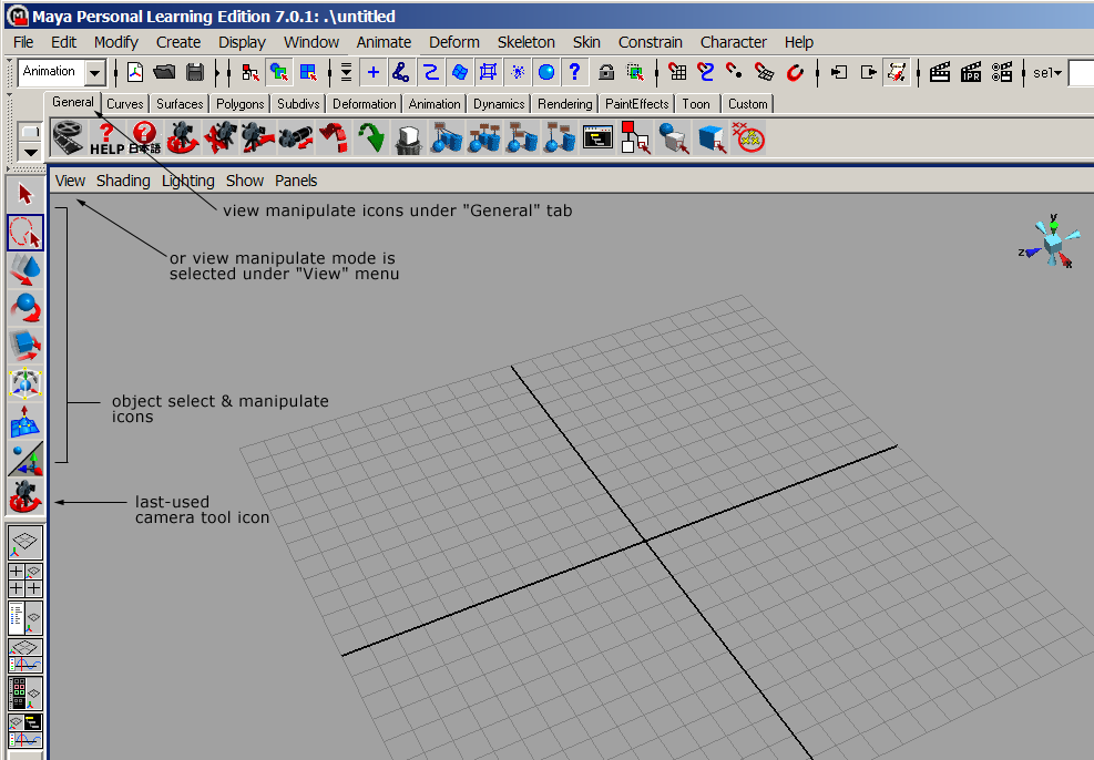
How Actions and View Transformations are done in Maya
Maya is a very heavily used professional 3D animation package. Basic mouse bindings are:
- Rotate: alt-left mouse button
- Pan: alt-middle mouse button
- Zoom: alt-right or alt-right-and-middle mouse button
- Actions: always left mouse button, specific action depends on current mode
- Context menu: space bar
The advantage of this approach is that the left mouse button is freed up for many possible tasks such as selection, grabbing widget handles, etc. Disadvantage is that it requires two hands to operate. (A free copy of an almost-fully functional version of Maya is available for testing ).
How Actions and View Transformations are done in Blender
Blender is an Open Source modeling and animation package similar in many ways to Maya (almost like GIMP is to Photoshop). Basic mouse bindings are:
- Rotate: alt-left mouse button OR middle mouse button
- Pan: shift-middle mouse button
- Zoom: control-middle mouse button
- Actions: mostly left mouse button
- Context menu: space bar
Note: Mac bindings
On a one-button mac, the following translations work by default in Mac OSX:
- single button -> left mouse button
- alt (option) + button -> middle mouse button
- apple (command) + button -> right mouse button
---
Proposed approach -- please comment!:
We are looking for user feedback on a proposed approach to solving the problems listed above, in a manner that echos what other 3D modeling packages do: providing explicit mouse modes which clearly differentiate whether a user is transforming a view, or performing some "action" by clicking or dragging the mouse. Please have a look at the interaction paradigm we're proposing and the description of the workflow it would generate for novice users and for expert users. This way of interacting is a little different from Slicer2's paradigm. Also see the analogous interfaces from Maya (a popular 3D modeling and rendering software package) and also SketchUp (which does some simple but powerful 3D modeling). Please contribute any feedback you have in the bottom section. Thanks for your help!
Details of the proposed interaction design:
- Mouse mode icons in "selected" (top) and "deselected" (bottom) states:

- Icons + descriptions:
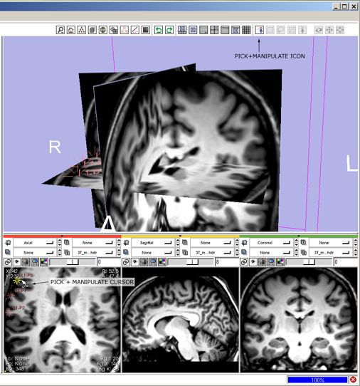
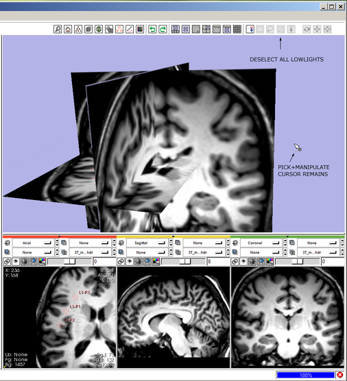
- pick+manipulate
 pick and/or manipulate an object as appropriate, like selecting and moving a fiducial point, or grabbing and manipulating a 3D vtkWidget, or for sampling voxel values, etc. When multiple objects (or objects of different types) are selected, this behavior may or may not apply.
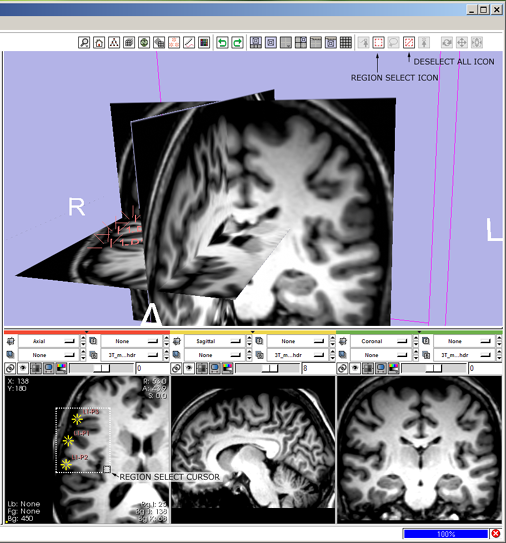
 - region-select
 rubber-band box to select multiple objects, selected state is persistent until deselected;
 - lasso-a-region
 manually drawn outline to select multiple objects, persistent until deselected;
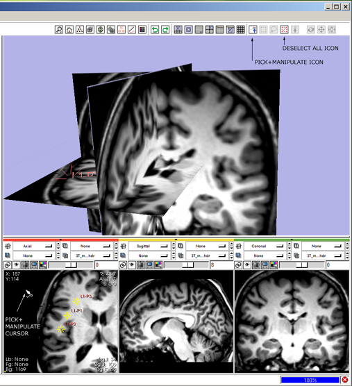
 - deselect all
 not really a *mode* per se. The Deselect-All icon becomes highlighted when anything has been "selected" with the region or lasso (persistent selectors), and it becomes lowlighted when nothing is "selected". Clicking the button when highlighted deselects all, and then lowlights the DeselectAll icon;
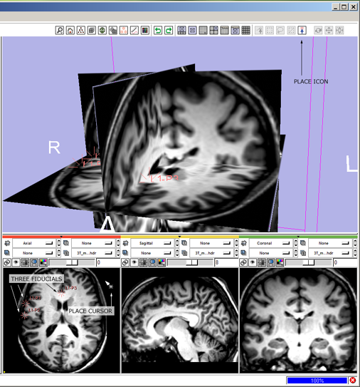
 - put
 for new placing fiducials, seed points, etc.;
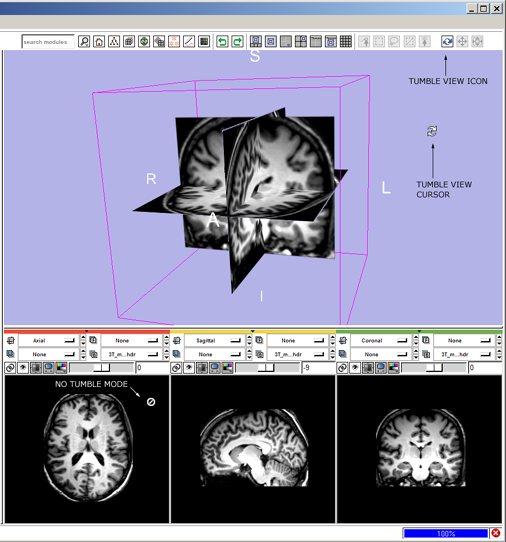
 - view-tumble
 rotates camera in the view plane;
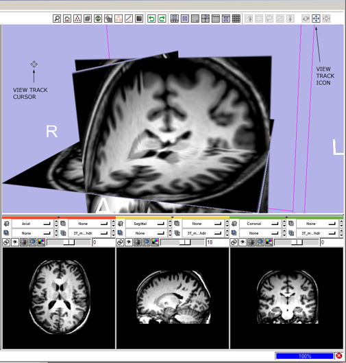
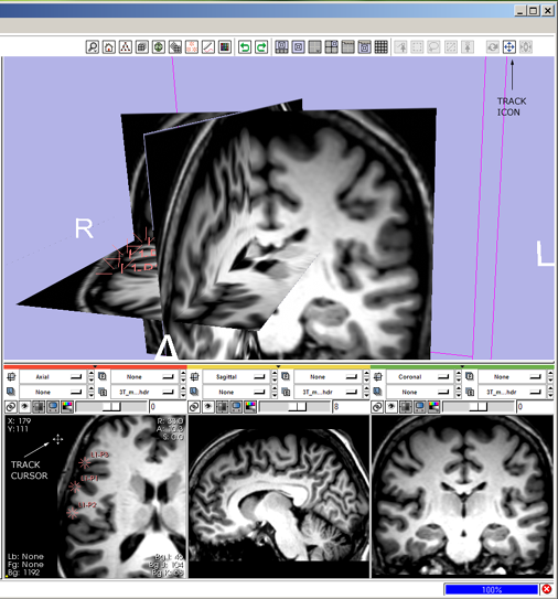
 - view-track
 translates camera in the view plane;
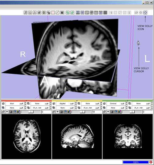
 - view-dolly
 moves camera closer to or farther from the scene.
- pick+manipulate
- Selected state and accompanying special cursor indicates current mouse mode.
- Each mouse-mode causes a special cursor to be displayed, as feedback to user.
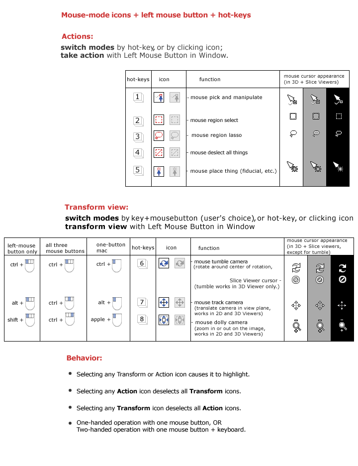
- Hot-keys to select a mouse mode are contiguous on the keyboard (action): 1 2 3 4 5 (view transform:) 6 7 8.
- View transform modes are also selected with key-modified mouse-clicks (see table below). But once a mode is selected, only left-mouse-button is required to transform the view in that mode.
- All mouse modes apply consistently in 3D Viewer and Slice Viewers, except the view-tumble mode, which is not defined in the Slice Viewers. When Slicer is in view-tumble mode, either:
- the view-tumble cursor would be displayed in the Slice Viewers but nothing would happen when the mouse is clicked *or*
- the pick-and-manipulate cursor will be displayed when the mouse moves over the Slice Viewers even though the tumble-view icon is selected and the tumble-view cursor is displayed when the mouse moves over the 3D Viewer, *or*
- a new cursor that indicates "mode-doesn't-apply-here" will be displayed when the mouse is over a Slice Viewer.
- Novice user can select mouse modes by clicking icons above 3D viewer, and current mode is clearly displayed.
- Intermediate or Expert user selects mouse modes by using a combination of keyboard keys and mouse buttons.
- Works with one (left) mouse button only, but other mouse buttons are mapped (for tumble, track and zoom) for people who have and want to use them.
- Context menu can be displayed with space bar, or with quick click-and-release of right mouse button.
---
Shown in the figure below:
- the icons for mouse-modes (their appearance when highlighted and lowlighted),
- suggested hot-keys and mouse-selection actions, and
- cursor appearance when any one mode is chosen.
- an example workflow for novice and expert users to perform the same simple task.
---
Simple workflow storyboard
Below is how a user would use the mouse-mode interface to tumble, track and dolly the camera to get the 3D View to look the way they like, and then put down three fiducial points and adjust their position. A novice user's workflow is compared with an expert user's workflow.
1 (novice) tumble: click the view tumble mouse-mode icon ![]()
- --> mouse-tumble icon highlights and all others deselect, cursor changes to indicate mouse-tumble mode.
- then left-Click and drag in the 3D Viewer to rotate the view.
- if the mouse moves over a Slice Viewer, the cursor changes to indicate that the mode doesn't apply.
1 (expert) tumble: ctrl+left-Click and drag in the 3D Viewer,
- --> mouse-tumble icon
 highlights and all others deselect; cursor changes to indicate mouse-tumble mode; view tumbles.
 - if the mouse moves over a Slice Viewer, the cursor changes to indicate that the mode doesn't apply.
---
2 (novice) dolly: click the view dolly mouse-mode icon ![]()
- --> mouse-dolly icon hightlights and all others deselect, cursor changes to indicate mouse-dolly mode.
- then left-Click and drag in the 3D Viewer to dolly the camera in and out.
2 (expert) dolly: shift+left-Click and drag in the 3D Viewer
- --> mouse-dolly icon
 highlights and all others deselect; cursor changes to indicate mouse-dolly mode; view zooms.
---
3 (novice) track: click the view track mouse-mode icon ![]()
- --> mouse-track icon highlights and all others deselect, cursor changes to indicate mouse-track mode.
- then left-Click and drag in the 3D Viewer to translate the view left-right, and up-down,
3 (expert) track: alt+left-Click and drag in the 3D Viewer,
- --> mouse-track icon
 highlights and all others deselect; cursor changes to indicate mouse-track mode; view tracks.
---
4 (novice) place fiducials: click the mouse-place icon ![]()
- --> mouse-place icon highlights and all others deselect, cursor changes to indicate mouse-place mode.
- then click the Slice Viewer's Fit-To-Window icon

- --> the Slice in that viewer (or in all viewers if their controls are locked) resize to fit the Viewer.
- then left-Click three times at x,y locations in a Slice Viewer to put down three fiducial points.
4 (expert) place fiducials: press 5-key to switch into mouse-put (or place) mode
- --> mouse put icon
 highlights, and all others deselect; cursor changes to indicate mouse-place mode.
 - then click the Slice Viewer's Fit-To-Window icon

- --> the Slice in that viewer (or in all viewers if their controls are locked) resize to fit the Viewer.
- then left-Click on three x,y locations in a Slice Viewer to put down three new fiducial points.
---
5 (novice) zoom the slice view: click the mouse-dolly icon ![]()
- --> mouse-dolly icon highlights and all others deselect, cursor changes to indicate mouse-dolly mode.
- then left-Click and drag in a Slice Viewer to zoom in.
5 (expert) zoom the slice view: shift+left-Click and drag in the Slice Viewer
- --> mouse-dolly icon
 highlights and all others deselect; cursor changes to indicate mouse-dolly mode; view zooms.
---
6 (novice) select and move fiducials: click the mouse-pick-and-manipulate icon ![]()
- --> mouse-pick-and-manipulate icon highlights, all others deselect, cursor changes to indicate mouse-pick-and-manipulate mode.
- move mouse to location of fiducial in a Slice Viewer and see the fiducial highlight; left-Click and drag in a Slice Viewer to reposition the fiducial point.
- move the mouse away from the fiducial and see it lowlight.
6 (expert) select and move fiducials: press 1-key to switch into mouse-pick-and-manipulate mode.
- --> mouse pick-and-manipulate icon
 highlights, and all others deselect; cursor changes to indicate mouse-pick-and-manipulate mode,
 - then mouse-over a fiducial point, see it highlight, left-Click and drag to reposition it. Release mouse button and move away, and see the fiducial lowlight.
---
7 (novice) pan the slice view: click the mouse-track icon ![]()
- --> mouse-pan icon highlights and all others deselect, cursor changes to indicate mouse-pan mode.
- left-Click and drag in a Slice View to pan.
7 (expert) pan the slice view: alt+left-Click to switch into mouse-track mode.
- --> mouse-track icon
 highlights and all others deselect; cursor changes to indicate mouse-track mode; left-Click and drag in the Slice Viewer to pan the view.
---
8 (novice) select multiple fiducials: click the mouse select-region icon ![]()
- --> mouse-select-region icon highlights and all others deselect, cursor changes to indicate mouse-select-region mode.
- sweep out a rubber band to enclose three fiducials and see them highlight.
- when fiducials become selected, the "Deselect-all" icon
 highlights.
8 (expert) select multiple fiducials: press 2-key to switch into region-select mode.
- --> mouse select-region icon
 highlights, all other icons deselect; cursor changes to indicate mouse-region-select mode.
 - sweep out a rubber-band box to enclose three fiducial points, see them highlight.
- when fiducials become selected, the "Deselect-all" icon
 highlights.
---
9 (novice) move multiple fiducials: click the mouse-pick-and-manipulate icon ![]()
- --> mouse-pick-and-manipulate icon highlights, all others deselect, cursor changes to indicate mouse-pick-and-manipulate mode.
- left-Click and drag in a Slice Viewer to reposition the fiducial points.
9 (expert) move multiple fiducials: press 1-key to switch into mouse-pick-and-manipulate mode.
- --> mouse pick-and-manipulate icon
 highlights, and all others deselect; cursor changes to indicate mouse-pick-and-manipulate mode,
 - left-Click and drag in the Slice Viewer to reposition multiple fiducials.
---
10 (novice) de-select fiducials: click the mouse-deselect-all icon ![]()
- --> the last mouse-mode (mouse-pick-and-manipulate) remains highlighted, and the fiducials are deselected.
- The "Deselect-All" icon lowlights.
10 (expert) de-select fiducials: press 4-key again to deselect the fiducial points
- --> the last mouse-mode (mouse-pick-and-manipulate) remains highlighted, the fiducial is no longer highlighted.
- The "Deselect-All" icon lowlights.
---
Please contribute comments here -- Thank you!:
PNL:
- Tumble view mouse mode: We would prefer the cursor indicating "mode-doesn't-apply-here" like it can be seen on workflow example 1 in order to avoid confusion.
- Deselected states of icons: This will not be a problem for anybody who uses slicer more often, but to a novice user the "deselected" state of the mouse mode icons might suggest that these modes are currently unavailable. This might be because in menues usually unavailable options are greyed out. Maybe all icons could be coloured all the time and the active mouse mode icon could be somehow indented or framed (like on the Maya screenshot)?
- The icons, shortcuts and different cursors look very good and it's great to have consistency within different views and modules. Also, the shortcuts are really easy to memorize!
- First we thought it would be good to have another mouse mode in which a mouse click on one voxel adapts all the views so that this voxels can be seen in all views (currently in slicer 2 this is done with holding shift and left clicking). But then we came to the conclusion that it would be even better if this functionality would be an independent hot key(shift+ click for example) that can be used in every mouse mode at any time, since we use this functionality a lot. Do you guys plan to have such a shortcut implemented?
- Does the general undo also apply to accidential mouse mode selections? For example, say you've selected 10 different fiducials and accidentially hit hot key "4" that deselected everything. It would be great if this could be undone as well.
- Minor thing that was not clear to me: if you want to change to say the "mouse dolly camera" mode using ctrl + right mouse key: Do you have to hold the ctrl key down all the time when zooming? Or do you only right-click once while holding crtl and then the mode is changed so that you can zoom in and out with only left mouse button?
- Do you have already plans about how this mouse interaction schema will work in the Editor module? Will it be the same, just with more hot keys for the drawing tools for example?
- Actually about the Editor Module: When drawing in the slices and the user mouses over to the 3D view, could the mouse then automatically be in tumble view mode in the 3D view?
- (not directly realted) It would be great to be able to switch between one's favourite modules using hot keys, is there anything planned like that?
- In case you have a labelmap overlayed on for example a structural volume: would it be possible to bind the mouse scrollbar(if existing) to fading the foreground in and out? Related to that: it would be good to have smaller increments available for the fading (compared to the fade bar currently available in slicer2) for more sensitive differences.
---
Slicer mockup and GUI screenshots from other packages:
Below are snippets of SketchUp's interface, and Maya's Interface. Maya's mouse modes switch between object transforms (translate, rotate and scale), object or region select, and an extrude function. SketchUp's mouse-mode icons switch between view transforms (translate, rotate, zoom) and an object extrude function.
