Documentation/4.0/Developers/Style Guide/UI

From Slicer Wiki
Revision as of 18:32, 9 April 2012 by Finetjul (talk | contribs)
Jump to: navigation, search
Home < Documentation < 4.0 < Developers < Style Guide < UI
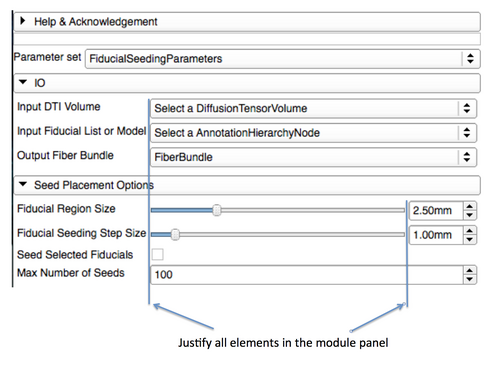
  • Elements in panels should be justified (use of a QFormLayout can simplify this task)
  • Sections should be organized in such a way that the workflow takes the user from top to bottom.
  • Capitalize the first letter in any text specified for a label or button
  • Try to use brief phrases when specifying text for a label or button rather than using sentences or sentence fragments ( use "Load volumes" instead of "Choose a volume to load")
  • Provide fully descriptive tool tips with each widget defined
GuiGuideline2012-03-27.png

Layouts

  • Use the default values for the margins or 0. Default margins are automatically controlled by the Slicer custom style (see QStyle::PM_LayoutLeftMargin)
  • The minimum size hint of the top level module widget is used to determine the minimum width of the module. In Qt Designer, you can ensure it's sizing is correct by changing the QLayout::SizeConstraint to QLayout::SetMinimumSize.