Difference between revisions of "Slicer4:ViewerDesign"
| Line 177: | Line 177: | ||
|width="10%" style="background:white;color:black"|#954473 | |width="10%" style="background:white;color:black"|#954473 | ||
|width="10%" style="background:white;color:black"|149 68 115 | |width="10%" style="background:white;color:black"|149 68 115 | ||
| + | |- | ||
| + | |width="5%" style="background:#9f5668;color:black"| | ||
| + | |width="10%" style="background:white;color:black"|Rose | ||
| + | |width="40%" style="background:white;color:black"|Unused | ||
| + | |width="25%" style="background:white;color:black"|Core | ||
| + | |width="10%" style="background:white;color:black"|#9f5668 | ||
| + | |width="10%" style="background:white;color:black"|159 86 104 | ||
| + | |- | ||
| + | |width="5%" style="background:#703543;color:black"| | ||
| + | |width="10%" style="background:white;color:black"|Brick | ||
| + | |width="40%" style="background:white;color:black"|Unused | ||
| + | |width="25%" style="background:white;color:black"|Core | ||
| + | |width="10%" style="background:white;color:black"|#703543 | ||
| + | |width="10%" style="background:white;color:black"|112 53 67 | ||
| + | |- | ||
| + | |width="5%" style="background:#7f2430;color:black"| | ||
| + | |width="10%" style="background:white;color:black"|Burgundy | ||
| + | |width="40%" style="background:white;color:black"|Unused | ||
| + | |width="25%" style="background:white;color:black"|Core | ||
| + | |width="10%" style="background:white;color:black"|#7f2430 | ||
| + | |width="10%" style="background:white;color:black"|127 36 48 | ||
|- | |- | ||
|width="5%" style="background:#6cad49;color:black"| | |width="5%" style="background:#6cad49;color:black"| | ||
Revision as of 18:08, 11 September 2011
Home < Slicer4:ViewerDesignBack to Slicer 4 Developer Projects
Contents
Project Description
Ron would like to see a scalable architecture for the visual appearance of Slicer viewers as we add more types of elements and more of them. This architecture will also need to be able to accommodate new types of viewers such as graphs and tables.
We would also like to prepare a guide for developers of new types of viewers:
- that ensures that all viewers have a consistent visual and interaction design,
- and that makes it simpler for a developer to implement their viewer.
Proposed Look-Up Table (this is under development)
- see ColorKeywords for names of colors
- see also the Slicer 3 Colors
| Background: black | Axial Viewer: orangered | Sagittal Viewer: gold | Coronal Viewer yellowgreen | ||||
| CompareViewer darkorange | 3D Viewer rgb(162,160,224) | test: lightsteelblue | Sagittal Viewer: gold | ||||
| Sagittal Viewer: gold | Sagittal Viewer: gold | Sagittal Viewer: gold | Sagittal Viewer: gold | ||||
| Sagittal Viewer: gold | Sagittal Viewer: gold | Sagittal Viewer: gold | Sagittal Viewer: gold | ||||
| Sagittal Viewer: gold | Sagittal Viewer: gold | Sagittal Viewer: gold | Sagittal Viewer: gold |
Slicer Reserved Colors and Viewer Colors Registry
| Color | Name | Use | Developer(s) | HEX | RGB |
| White | Indicates active slice/frame in a multi-slice/frame viewer. | Core | #ffffff | 255 255 255 | |
| Grey1 | Unused | #c0c0c0 | 192 192 192 | ||
| Grey2 | Unused | #676767 | 103 103 103 | ||
| Grey3 | Unused | #4f4f4f | 79 79 79 | ||
| Grey4 | Unused | #383838 | 38 38 38 | ||
| Black | 3D Viewer Background & Default Widget Text | #000000 | 0 0 0 | ||
| Yellow | Saggital Slice Viewer | Core | #e6cf49 | 230 207 73 | |
| Light Yellow | Unused | Core | #f6f2c2 | 246 242 194 | |
| Wheat | Unused | Core | #ded6a5 | 222 214 165 | |
| Buff Yellow | Unused | Core | #d5d86f | 213 216 111 | |
| Yellow Ochre | Unused | Core | #c19a1c | 193 154 28 | |
| Camel | Unused | Core | #765d10 | 118 93 16 | |
| Red | Axial Slice Viewer | Core | #ef4832 | 239 72 50 | |
| Light Red | Unused | Core | #d5a6a5 | 213 166 165 | |
| Magenta | Unused | Core | #954473 | 149 68 115 | |
| Rose | Unused | Core | #9f5668 | 159 86 104 | |
| Brick | Unused | Core | #703543 | 112 53 67 | |
| Burgundy | Unused | Core | #7f2430 | 127 36 48 | |
| Green | Coronal Slice Viewer | Core | #6cad49 | 108 173 73 | |
| Blue | 3D Viewers | Core | #707ee2 | 112 126 226 | |
| Slicer Blue | Default background on 3D Viewers | Core | #a2a0e0 | 162 160 224 | |
| Grey | Generic Slice Viewers | Core | #8c8c8c | 140 140 140 | |
| Orange | Compare Viewers | Core | #de6e11 | 222 110 17 |
Notebook for Slicer 4 Presentation Layer Design
Notes & Sketches (Chronologically listed)
On Color-coding viewers & Qt Colors
- (from Jim) Many of the viewers we are using colors from the Qt palette. The viewer "name" is color alias that is recognized by Qt. But it doesn't need to be this way. We could always go through a lookup to map viewers with nonstandard color names as the viewer name to a RGB triple. We'll just need to slip in that mapping in the appropriate places. Qt accepts "named colors" from the SVG color keywords. See http://www.w3.org/TR/SVG/types.html#ColorKeywords. Qt can also take ANY color specified as RGB, HSV, etc. components.
- (from Julien) There are 2 kinds of palettes:
- a general "Qt application GUI" palette (color of the background, buttons, text, shadings, highlight color). This is QPalette.
- a Slicer/MRML specific palette: color of the slice views, renderer background color of the 3D view, highlight of current view (slice or 3D). For now there is no placeholder for such a palette. I somewhat started to gather them in qMRMLColors.h/cxx. However, I believe it should be a VTK/MRML palette. Where MRML could provide a default palette, that can be extended/replaced by a Slicer palette.
- (from Julien) I've noticed there has been some work done in the past to allow such kind of feature: Slicer4\Modules\Meshing\BuildingBlock\vtkSlicerColor.h/cxx. I'm not sure in what extend we could reuse/generalize that work. For information, vtkMRMLViewNode already hardcodes the light blue background color.
- (question from Julien) Shall we make such a palette a singleton in MRML, or should it be a vtkMRMLScene member, other ideas ?
- (from Jim) The colors for the various viewers feels more like "application settings" or "look and feel" than MRML. I don't feel strongly about this but I wonder if the colors just need to be accessible from the Application object. I guess since we store things like the layout in MRML, it would make sense for the available colors to decorate the UI also be established in MRML.
- (from Wen) A first suggestion for how to color-code and ID viewers -- straw man for discussion:
- Keep Slicer Axi/Sag/Cor color coding, and all other individual slice viewers are grey
- Keep Compare Viewers Orange
- Make 3D viewers blue (better shade than in mockup!)
- darken down the hairline frame around all viewers so "active" viewer is more apparent.
- Multiple viewers of same viewer-type get a numerical ID
- Create list of colors that developers register new viewer types to...
- Helper code to create a viewer frame with same appearance & behavior
- Question: Will we have more than one active viewer?
- what would be a use case scenario?
- what does active mean?
- Question: Will we have more than one active viewer?
- Lighten display up: if GUI panels are collapsed by default, and only expose on rollover, then we don't need to tie the image viewer to the color bar with a hairline of the same color. We can just use a just-noticeable grey divider which turns white on highlight. This may clean up the overall appearance a bit.
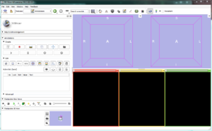
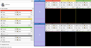
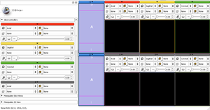
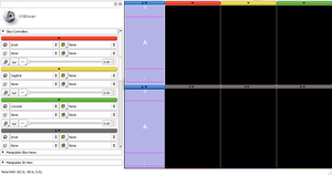
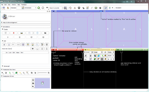
- Mockup with new rollover design. Larger area for rollover activation of controls and clicking to pin them open (easier to hit a larger target.) Gap between the hot area and the slice scroller to minimize mistakes. Slice numbers always visible and editable. Active window shown with a symbol and white outline.
- Mockup with extra gap to minimize inter-viewer clicking mistakes.
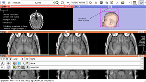
- Mockup with link status displayed AND with recenter button exposed on 3D viewers as per Ron's suggestion. Suggestion to make controls hug the widget boundary on right viewer side (if controls exceed some minimum width requirement) to make it clearer that they belong to a viewer, rather than that they are an independent window full of widgets...
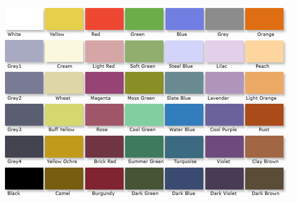
- Draft palette for viewer colors against which developers register
Slice Controller scetches
Link to sketches for controllers
Summary from tcon discussion 8/2/2011: Three types of "colors" in Slicer4
1. Qt application "skin" which can be selected through an Application Settings interface. This includes background, buttons, text, shadings etc.
- This is implemented as a QPalette.
2. Slicer reserved colors that should-not be adjusted by the user.
- Colors of the roll-over bar on specific viewer types (Slice Red, Yellow, Green for example) should not change. This permits all Slicer users to discuss presentation of data in a consistent way, independent of how Slicer's presentation layer is styled.
3. MRML-specific colors that are restored with the scene. This includes 3D view background color, Fiducial color, etc.
- The set of color options are currently being collected in qMRMLColors.h/cxx.
QUESTIONS
- A question remains on which category color-styling of vtk widgets falls under (e.g. colors of widget handles and highlights). Importantly, widget handle and highlight colors form a visual language that a user understands (grab here, this grabbed guy is active, etc.) Changing these color codes is effectively breaking the rules of that language. A user has to experiment to verify that they understand the interactive behavior of the widget. For this reason, wjp recommends we categorize widget handle colors as color type "2" above -- Slicer-reserved that are not adjustable.
- being able to change the color of a fiducial is important. E.g. I have two fiducial lists and I would like to make one bone colored and one vein colored. Is the color of the fiducial a handle?
- How to implement Color type 2 -- also as part of qMRMLColors.h/cxx?
SKINS
Alternative appropriate skins should be exposed as options under an Application Settings Interface. Skins that are tailored to different use cases (radiology reading room, or in the OR e.g.) are of interest. Skins may or may not be specified in the MRML scene, but if a scene is loaded, a user's skin should not change automatically -- maybe a viewer is prompted for whether they want to switch to the application interface appearance described in the scene file, or whether they want to preserve their own.
Julien has sent Wen instructions for how to create skins in Qt.
